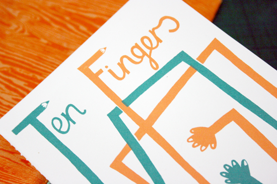
I'm not completely sure on this layout. My favourite part of this design is the grainy background, I've simply scanned in the roof of the scanner and the slight scratches and marks have created this effect.
Monday, 28 February 2011
My First Zine!
Today I made my first small zine! It contains a brief look at my portfolio. I'd really like to create more of these in the future, and will do so for my FMP, which I'm planning ideas for today.
Narrative Image
Here are my final pieces for my narrative project. I chose to narrate some selected text from the lyrics for 'there is a light that never goes out' by The Smiths. I thought that the lyrics were quite bleak and dark, so I did not want to contradict this by giving my image bright colours that seemed irrelevant to the text. I also wanted for this illustration to be subtle, not just narrating the text, but giving an impression of what I thought was relevant to the text.
Tuesday, 22 February 2011
Monday, 14 February 2011
Websites of Interest
I am currently designing my website, I have changed my mind about my last design and now want to go for a more simple design. Here are some websites that are of quite a similar style to how I want to make mine.
Type Project
The aim of the Type project was to create a poster that helps promote a book. I chose to promote the book 'Hand Job - A Catalog of Type', it is about hand drawn created type, which I find particularly interesting and felt I would be able to create a design that would compliment this style.
Here are a few thumbnails of my final design, showing different colour variations that could be my possible final outcome.
After receiving feedback on these designs, this image below was selected by majority as the most successful colour combination. It was also suggested that the design was fairly plain and could maybe do with adding some more complex shapes into the design, which I agree with.
Museumaker - Laura Thomas
Here is my final design for the Museumaker live project. This will be placed in the centre of canterbury in order to help promote the re-opening of the Beaney Museum.
Monday, 7 February 2011
Website
Just finished creating this logo for my website. I particularly like how the design is contained within a circle and incorporates all the elements that I aimed to include; Hand-drawn type, dulled down colours and multiple layers.
Subscribe to:
Comments (Atom)


